How to Enhance User Experience Beyond the Screen
How are your customers interacting with you brand lately? Have they come back to visit your site again? Were there repeat purchases and recommendations online? These questions are just indicators to see if you are monitoring your customer’s user experience with your brand. When tackling the user experience of a product, the goal is to provide a solution to what your users need in that moment.
A great user experience focuses on having a deeper understanding of what the user needs, values, their abilities and their limitations. Marrying it with what your business goals are and the objectives of the group managing the project. To promote improving the quality of the user’s interaction and also the user’s perception of the product or services. A great user experience on your site helps your viewers find what they need with ease and convenience. The content forms available on your site should be engaging enough to make them stay and come back for more.
When you improve your user experience, you create a smooth relationship between your website and your target audience. You help guide your viewers through the conversion funnel reducing obstructions on their way to make a purchase. When you have a new viewer on your site and they became impressed with your content, there is a chance he or she might follow your page. That viewer now becomes your lead which you will nurture by giving exemplary service. You can give him or her special information about your products and offer discounts and free tools. Generally, this is how your conversion funnel will work.
So how are you going to enhance your user experience beyond the screen? Take a careful evaluation of your site and make a list of the areas that need improvement. To help you do so, here are some of the tips to guide you in enhancing your user experience:
1. Quick Loading Time
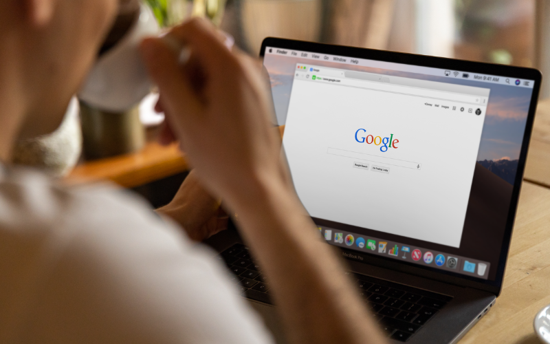
If your page loading time is slow, your users will get impatient and frustrated. Speed matters a lot to your customers. When they get frustrated to your page, it’s very easy for them to switch sites and look for another brand that offers the same product as yours. So, make sure that you don’t make your users wait. Optimise your images because they account for a significant portion of loading time. There are many tools available that you can utilise to help you with optimising pictures on your page. Set up as many automated speed improvements as much as possible. You only have a few seconds to make a good impression on the user. If your site is too slow or complicated, your customer is most likely to leave.
2. Avoid Stock Photos for Better User Experience
Images can be a powerful way to capture users’ attention and differentiate your product.
Why not use your team’s actual photo than a random photo of a woman in business attire? Online customers are smarter these days and they can easily detect if the photos on your page are authentic or just stock images. Aside from the fact that they don’t connect with the user, it also diminishes the value of your brand. So be authentic and use realistic images.
Another way is to use compelling, relevant and original photos. Just like writing, every picture has a story to tell. Original photos of your business or company is unique and can leave an impact to the audience. Compelling images has a special ability to inspire audience. One of the most dangerous elements in any design is imagery that conveys the wrong message.
3. Placement of CTAs
Call to Action or CTA invitation for the audience to take some desired action. It can be in a form of writing (persuasive writing), a call to action buttons or a CTA cart. The placement of your CTAs has a great impact to your users. It works best when placed in the area where your users find the information they need. In other words, your CTAs should not be randomly scattered all throughout your page as it can irritate your users. Strategically place your CTAs at the point where users are likely to take action (most webpages use CTAs at the end of the blog.) Also, avoid putting your CTAs next to each other or on top of the other as it causes confusion.
It's generally best to only have one CTA. If you need two, the second one should really be something you don't want them to do yet. It should really recede somehow (less contrast, less colour, thinner font, etc.) Three is out of the question. You listed "no" as the third option. They can already decide that by clicking away, not "making a choice." Avoid decision fatigue at all cost. When you really dig in, you realize there are a lot more decisions for someone to take than you would assume.
4. Understanding Your User’s Behaviour
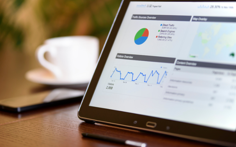
It is important to understand your user’s online behaviour. What’s the first thing they usually do or read when they come across your site? If you don’t know the answer, then you should start studying how people are navigating and clicking through your site. Scrollmaps can show you the scrolling pattern of your users once they visited you. It actually lets you see where on a long-form page your user stopped scrolling and where the activity started to pause. By looking into this, you’ll have a better idea of your strategic areas where you can place your CTAs.
5. Optimise the Important Pages
This helps your user engage in your site with less obstacles. What are the most important pages on your website? These may include your homepage, landing page, sales page, about us page and contact page. Optimising pages take time and doesn’t need to be rushed. Prioritise which is of utmost importance then you can do the rest one at a time. When doing so, you can run some user behaviour reports, and start A/B testing.
6. Improve Your Customer Service
Customer service is an important element of user experience. It strives to meet and exceed your user’s expectations as they interact with your brand. Make sure to give your users the optimum experience – treat them with utmost care, provide the best possible tools, offer quick action to queries. Ensuring that your users receive the best customer service makes them stay loyal to you and keeps them from turning to your competitor.
User experience matters a lot to your success as a business. Since your website holds the first impression your users have on you, your users have the power to decide whether it is worth their time. So, give your users the best possible experience that they deserve.
Conclusion
At Elephant in the Boardroom, we take the time to know our client needs and understand where you want to go next. We learn everything we need to know about your business and perceive challenges from all angles. By defining objectives, we set metrics for success. We collaborate and listen to you.
If you need help enhancing the user experience for your website, talk to us at the Elephant in the Boardroom. Visit us at www.elephantintheboardroom.com.au to learn more.