How to Make Your CTAs Convert Like Crazy
In its simplest terms, a call to action (CTA) is a click button for your audience, inviting and persuading them to take a desired action, e.g. “read more”, “buy now”, “sign up” etc. For something so seemingly straightforward, CTAs can be extraordinarily powerful and influential. Therefore, they should be implemented in a highly strategic way. The fundamental role of CTAs is to guide users towards your conversion goals.
Consider what you want visitors to do when they see your ad or website. E-commerce business owners will likely want them to make a purchase. Content and visuals alone is usually not enough to push prospective customers over the edge. You need to spell it out to them with clear, concise and striking CTAs. For our ecommerce store, this generally looks something like “shop now” or “browse the range”. These simple prompts trigger an immediate mental stimulus that can send your conversion rate soaring when done correctly.
It’s clear that CTAs play a vital role in customer conversion. In fact, they are a non-negotiable. A campaign or a website isn’t much use if it’s void of them - in other words, it is taking a passive approach. Be proactive in your strategy. Customers don’t just come knocking on your door, they need to be invited inside.
Here are some top tips to make your CTAs convert like crazy.
Choose your colours wisely
While there is no “best” CTA colour per se, certain colours have a much higher chance of winning conversions than others. The golden rule is to make sure your CTA buttons don’t blend in with your site’s colour scheme. They are there to be noticed, so make them pop with striking, contrasting colours. For context, Hubspot carried out a fascinating study whereby they tested two CTA buttons in different colours to see which generated more oh-so-lucrative clicks.
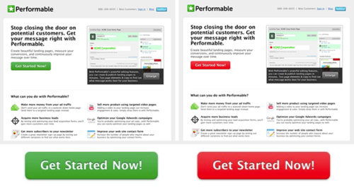
What is interesting about this experiment is the generally accepted connotations of green and red. Traditionally, green is associated with “correct”, “go”, and other positive affirmations and actions. Red, on the other hand, is often seen as a caveat, or associated with stopping. Based on these presumptions, it’s fair to assume the green button outperformed the red, right? Funnily enough, the red button prevailed, a victory which could be owed to its contrast with the page’s colour scheme. This also demonstrates the importance of testing, which we’ll get to shortly.
Use the right hierarchy
If you have multiple CTAs on one page, make sure they are positioned and designed strategically. Take, for example, the standard “view basket” page on an e-commerce store. These typically display multiple CTAs, including “return to shopping”, “update cart” and “proceed to checkout”. But which action is most important in terms of conversion? “Proceed to checkout”, of course. This is the button that has the best chance of sealing the deal, so make sure it stands out and overshadows the other CTAs.
CTAs should never be competing for the spotlight. Consider which holds the most value, and make it more eye-catching than the rest. This could be a matter of simply increasing the button’s size or using a bolder colour.
Create a sense of urgency
Building a sense of urgency can generate impressive click-through rates. Simply adding the word “now” can boost them significantly. If you’re running a temporary sale or promotion, this tactic is appropriate. Use your CTA to let visitors know there’s a time limit on the offer, and if they don’t act quickly, they might miss out.
Another good use of this strategy is if you are selling ticket events, whereby you can warn users that they are likely to sell out soon. This puts pressure on the audience to get off their laurels and click the golden button, ergo more conversions.
Try speaking in the first person
Traditionally, we tend to speak in second person lingo when it comes to CTAS, i.e. addressing the reader as “you”. Flint McLaughlin from Marketing Experiments disagrees with this time honoured tactic. His rationale is that the second person narrative can sound as though you’re speaking at the customer, rather than to them. This creates a disconnect which isn’t particularly engaging. In this sense, he suggests using first person CTAs such as “view my offer” or “download my free copy”.
Try this out for yourself, and see if it changes your click-through rate. Remember, when it comes to CTAs, small nuances can amount to big success.
Test, test, test!
With any campaign or website, testing is the secret sauce. This is the best way to gauge how certain CTAs are performing, and adjust your strategy accordingly. Take the time to carry out A/B split tests before launching anything. This will ultimately get you the best return on investment, as it will tell you clear as day which CTA is converting at a higher rate. With this invaluable information, you can put all of your eggs in the right basket and reap the rewards.
CTAs aren’t rocket science, yet so many companies get them wrong. By implementing these key recommendations, you should start to see a noticeable increase in your click-through rates, and your conversions too. Adjust, test, rinse and repeat – that is the recipe for long term success.
Final Thoughts
Need help building a website that converts? Elephant’s got you covered. The team of creative design experts at Elephant in the Boardroom are passionate about developing beautiful, bespoke website with a strong focus on the customer journey. We take the time to get to know your business and its individual needs to create a holistic digital marketing strategy tailored to you.
Talk to us today at www.elephantintheboardroom.com.au.